
Do you even need a presentation?

Summary
You can convey information in the workplace using several mechanisms. A presentation is a powerful storytelling and influence tool that you must employ only when you need it. The hierarchy of communications approaches, from the most common to the most infrequent, is as follows:
Documents
Infodecks
Web applications and interactions
Recorded presentations
Live presentations (online or in-person)
We often conflate presentations with the presentation file or the slideshow. That confusion leads to an overt focus on the slide deck and less focus on the presenter or the narrative. Here’s how I define the term “presentation”.
A presentation is an act of storytelling in which a presenter orchestrates narrative, timing, and emotion to create meaning that neither visuals nor documents can achieve on their own.
As a corollary to that definition, the slides are not the presentation. A presentation is a powerful tool for influence. You’ll get most value from presentations when you reserve them for the situations when they’ll be most impactful. At other times, you might be able to get away with conveying information using simpler or alternative methods.
Most of the time, a document is enough.
In most corporate scenarios, we’re just conveying information. Over the years, we’ve learned that visual content is easier to consume. Sometimes, the effective use of slideware can indeed make information more approachable, and I’ll address those cases shortly. Most of the time, though, slideware is a poor tool for well-structured writing. When we start using slides as a document format, we force readers to consume information in fragmented, disconnected bursts.
In contrast, a document that organises your ideas in a linear structure helps others build up their understanding as they read. By including diagrams where necessary, you can provide readers a visual metaphor to encapsulate what you’ve written. When you employ simple language, short paragraphs, headings, subheadings, bullets and tables, you help time-poor colleagues to scan your writing, and consume the essence of what you’re communicating.
The great advantage of using writing tools like Microsoft Word, Hemingway or Grammarly is that you can codify the writing style you wish to follow, and the reading ease you’re aiming for. Much like an IDE plugin assists a developer in writing code, these tools help you simplify your language so it's easier to understand.
Most writing tools come with features to suggest changes, and that workflow makes it easier to improve the document to a point where it can stand alone as an independent, low-context artefact. Cutting, pasting, and reorganising text in a document is also far easier than doing so in slides. In cases where the content deserves hefty detail, you don’t spend hours trying to make things look pretty on a slide. Instead, you can focus on simplifying that detail for your readers.
Moreover, slide decks often leave things unsaid between slides, and when communicating async, it can lead to misunderstandings. When you write, the linear structure of documents forces you to bridge different sections of your writing. From the reader’s perspective, if they even use an LLM to summarise your document, the explicit nature of linear writing reduces the probability of hallucinations.
So, in most corporate communication scenarios, a simple, linear document should suffice. There are some situations, though, where you may want to transfer this asynchronous content to a more visual medium.
Infodecks are the novice designer’s page layout solution.
Slideware applications offer a ubiquitous page layout interface for users unfamiliar with sophisticated desktop publishing. They support layer-based editing. Elements on top hide the elements at the bottom. What you see is what you get. Considerations like page size and margin width, which matter in print, don’t matter as much when you’re viewing an artefact on your computer. You can produce decent-looking ebooks without a lot of specialised design skill. Take, for example, a trip memoir my son wrote, which I then laid out in PDF format with the help of slide software.
In corporate settings, this ease of authoring translates to other documents - Martin Fowler calls them infodecks. Infodecks aren’t slideuments and don’t double as presentation devices. They’re only for what I’d call “light reading”. They juxtapose text with visuals and communicate information in a concise and approachable manner.
Martin’s website features several infodecks. My employer, Thoughtworks, has created a bunch of elegant and practical infodecks, too. Here are a few examples:
Responsible tech playbook (UN version)
Responsible tech playbook (business version)
In contrast to professional desktop publishing tools like InDesign or Affinity Publisher, software like PowerPoint, Keynote, Canva and even Google Slides offer an easier editing interface for most knowledge workers. But you don’t get this editing superpower for free.
Authors must still write their content well — coherence matters. Effective infodecks don’t sacrifice ease of comprehension for brevity. As Mark Twain (or Blaise Pascal) famously said, “I’d have written a shorter letter, but I didn’t have the time.” Writing short but meaningful text is a skill that takes time to execute.
Infodecks are most effective when the writing originates in a writing app that offers you tools and plugins to write well, collaborate with your colleagues and refine your message.
Design makes an infodeck succeed or fail. The scarcity of design sense among knowledge workers is one reason most infodecks are ineffective. Indeed, the highest cost in producing infodecks comes from leveraging skilful information designers who can collaborate with subject matter experts to produce the final artefact.
Laying out infodecks in the ubiquitous slide interface can make concepts and ideas shine, and they could be worth the effort if you expect your content to have a long shelf life. But don’t underestimate the design effort behind these artefacts. Duarte Design offers a beautiful, if dated guide to authoring what they call Slidedocs. “Slidedoc” is another name for an infodeck. Read the ebook, and you’ll learn several patterns that you can then implement in the slideware of your choice.
Use web interactions and applications to manage cognitive load
In the last year or so, we’ve seen an explosion of coding harnesses that allow non-developers to spin up simple applications. Using HTML, CSS, and JavaScript, you can embed content from external sources and use interactivity to manage your readers’ cognitive load.
Consider, for example, the word cloud below, which groups the company values of several IT, consulting, and design service providers. You can filter the values by clicking the company names, or hover over a specific value to see which companies have claimed it. You could provide this information through a document or a spreadsheet, but you’ll then rely on the user to manage their cognitive load.
Another example is this microcourse, that’s based on a long-form article about how leaders shape cultural identity in groups and corporations. The content is almost the same as the original piece. Still, by chunking the concepts, adding interactions for the learner to explore, and including reflection questions to test their understanding, I’m managing their cognitive load.
If you can document your design direction and your underlying content is comprehensive enough, you can produce such simple content by leveraging a coding harness. Of course, there are the complexities of how you host such content for your coworkers and the shelf life of such applications. Since I’m not a software engineer, I estimate the shelf life of such applications in proportion to how well I understand their inner workings.
When none of the above options is suitable, and you feel convinced that the story needs your voice, that’s when you must consider a presentation. And even when you decide to present, a slide deck isn’t mandatory. Nor is it necessary to present live.
Recorded audio and videos are a substitute for live presentations
The easiest foray into presentation territory doesn’t even need visuals. A well-written monologue, whether in audio or as a talking head, is sufficient to convey some ideas. You benefit from the richness of tone, the drama of pauses and pacing, and your unique voice. Ed Zitron, the critic-in-chief of the AI capex bubble, delivers regular monologues on YouTube without any visuals and still manages to have a cult following.
You can, of course, step up the production effort and add visuals to your voiceover. This is where slides can come into the picture. Modern presentation tools like Canva, PowerPoint and Keynote help you create cinematic builds and transitions, so you don’t have to seek high-end animation skills or a professional video editor to make a point. There is a catch, though. When people watch a 30-frame-per-second video, they’re not expecting static slides on their screens. So, if your video only includes a voiceover and slides, you must cycle through builds and transitions much faster than when you are on screen. My video making the case against brainstorming is one such example. It’s 8 minutes long, with 129 builds and transitions to maintain the tempo of an online video, and, in hindsight, I’ll argue it’s slow.
On the other hand, my recorded presentations about cultural identity, where I appear on screen, span 141 builds and transitions over 24 minutes.
Either way, you might be aghast at the number of builds I’ve just told you about. And that’s the thing — there’s no formula for the right number of builds and transitions. Whatever helps you tell your story is what you need. No one counts the extra slides and extra transitions as long as your message shines.
Recording a talk forces you to be brief and cut the fluff from your narrative. Your audience can consume your content in their own time, slow it down, speed it up or play it multiple times if they so desire. Closed captions help others understand your accent, and chapter markers help viewers and listeners navigate to or revisit topics of interest. With all these benefits, it’s fair to say that most presentations are better off in a recorded form.
So, when do you go live?
These days, live presentations come in two flavours: online and in-person. Either way, the purpose of a live presentation is to interact with people. At a conference, it could be to build your network and enhance your professional profile. At work, it could be about fielding objections and using synchronous presence to influence your coworkers.
I suggest reserving live presentations for the highest-stakes interactions, e.g. pitching to a client, delivering a keynote, celebrating collective success, or energising a community. The reason? Well, that’s because of the scheduling overhead. If you’re getting people into the same physical or virtual space to share something with them, it should be well worth everyone’s time.
And I recommend a high degree of prep for live presentations. People can’t speed you up or slow you down. Depending on the medium, there may be no closed captions to help people understand you. Pacing, articulation, preparation, and the synchrony between what you say and what you show are key to making a live presentation impactful.
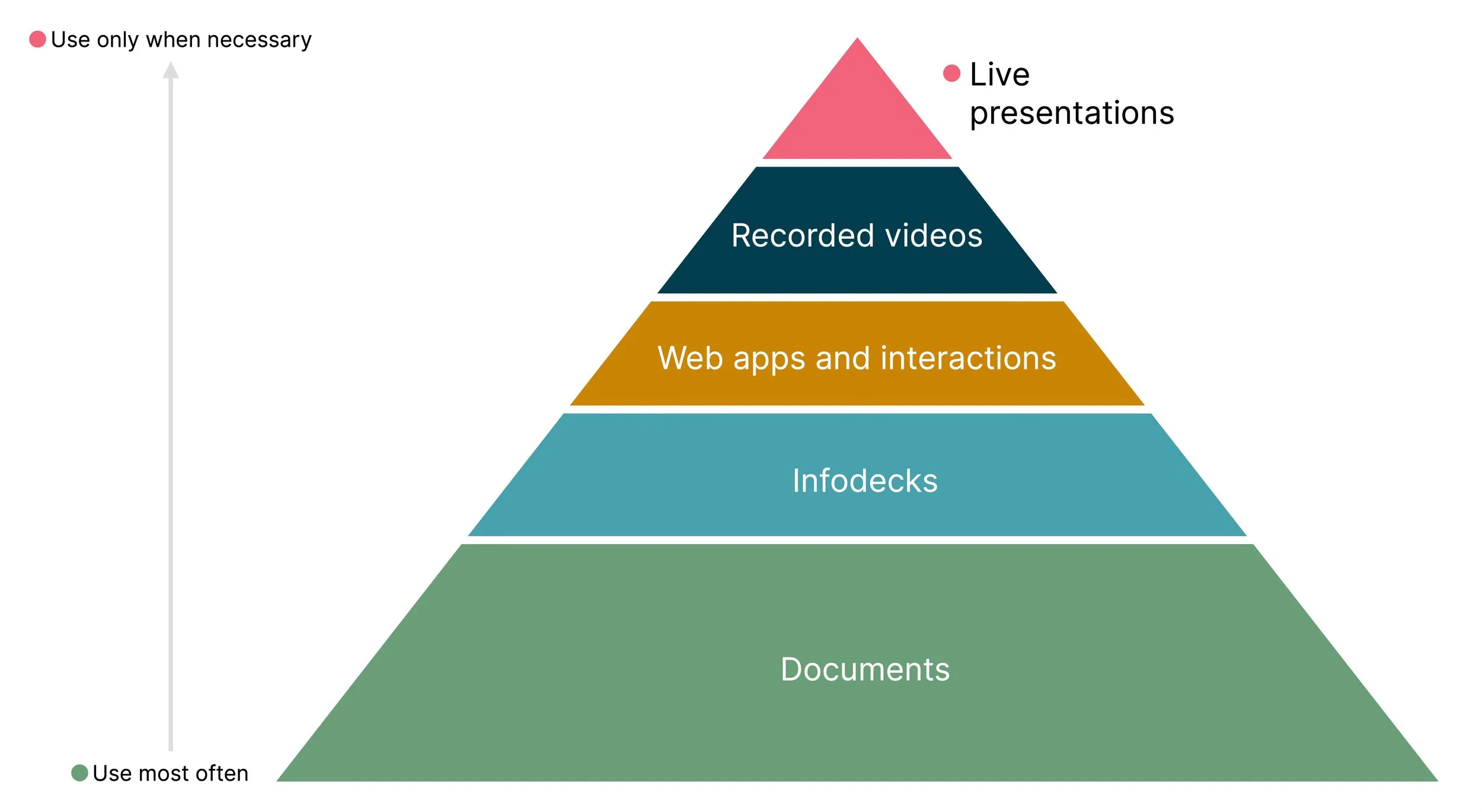
A hierarchy of communication approaches
With all the alternatives available to you, I urge you to consider whether you must present the information you want to convey. Perhaps the answer is yes. The narrowed-down choice is then between recorded, online, and in-person presentations. Those are the three interactions we’ll focus on over this series of articles. Next up, let’s discuss how to craft your story before you even touch any presentation tools.